Logo ontwerp: onze handvatten & principes
Logo design
As a strategic communications agency, we are regularly asked to design a logo. Although a logo alone is not enough - and we therefore do not offer it 'separately' without a corporate identity - it is one of, if not the most important expression of your brand. A logo that’s rock solid is an absolute must.
Wondering how we design logos that the target audience instantly recognizes and admires? In this blog post, we share the main principles and tools we use to create a strong and memorable logo. Spoiler alert? Keep it simple!
The target audience first
A misconception we often hear is that clients' main concern is that they themselves like their logo and think it looks “nice”. While it is certainly important that you stand behind your logo, it is even more important that your target audience does. After all, they are the ones making sure that money comes into your pocket. While this obviously depends on many variables, when it comes to the influence of a logo, you can assume the following maxim: the more the target audience can identify with your logo, the more they will be willing to purchase your product and/or service. Before we start designing a logo, we always research the target group.
Recognizable and simple
Think about the first logo that comes to mind. Chances are that this is a simple shape, and that it is a logo of a major brand. It’s therefore no coincidence that these well-known brands use a simple logo. This is because you have less to remember so what’s there, quickly becomes recognizable and memorable. Well-known examples of this are the logos of Adidas, Apple, and McDonald's. Another lesson from these examples is that a logo does not have to be a literal representation of your company. After all, Apple is not an apple farmer either! That being said, an imagination, abstract or otherwise, can be an excellent starting point for a logo without compromising on simplicity. For example, we based the logo of bicycle specialist Hendrikx 2-Wielers on the tire track of a bicycle wheel.

Hendrikx 2-wielers logo based on bicycle tire track.
Timeless
When a logo is recognizable and simple, chances are it’s also timeless. In fact, you also increase recognizability by sticking with your logo for a longer period. Moreover, when people interact with your logo for a longer period, it inspires confidence in your brand. When they also have positive experiences with your brand, they always associate your logo with this and remain loyal to you. Think, for example, of that one car brand you went on vacation with as a child and now drive yourself. Or the typical Coca-Cola (Christmas) commercials, in which "happiness" is very clearly linked to the logo and brand at every stage of life. However, this does not mean that you should just stick to it: after all, your logo may not be timeless at all, but dated, or it may no longer match your company and/or target group as was the case with our client Big Ass Battery.

Big Ass Battery logo update to a 2.0 version.
Applicability and consistency
We already mentioned it in the introduction: a logo alone is not enough, so we do not offer it 'separately'. A logo is part of a corporate identity. Both enrich and complement each other. By taking this into account before and when designing a logo, we ensure that it fits the target group and appeals to them appropriately. The color and shape should also be consistent and should not differ in its intended uses. For example, the logos we developed for Qonnect and its sub-brands had to be usable on standard print and online as well as to be incorporated on their tools and packaging.
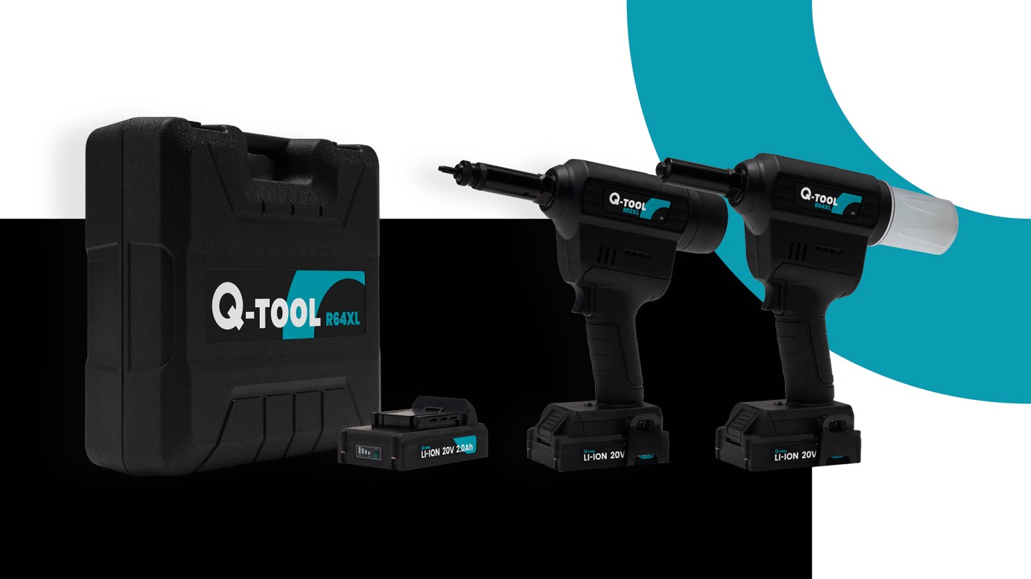
Qonnect Q-tool logo applied to tools and packaging.
We can say that designing a good logo is an art itself that cannot be seen separately from a corporate identity. It takes time, attention, and an eye for the target group to design a recognizable, simple, and timeless logo that can be applied broadly and consistently. At Mannen van 80 we have the right knowledge, skills, and creativity to do this, and we are only too happy to apply them to create not “nice” things, but strong brands.
Wondering what we think of your logo and what we think could be better in translation? Be sure to contact us!
Interesting?
Also read our other blogs